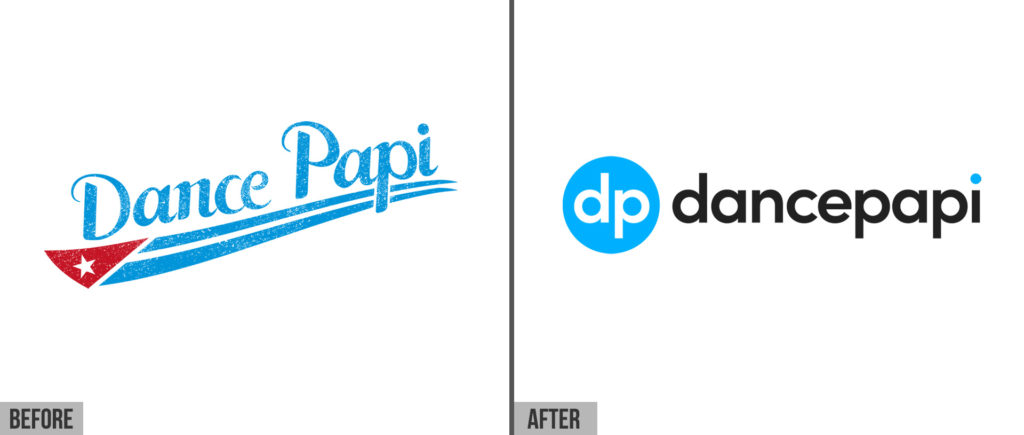
The original Dance Papi logo was created many years before the website launched. Although celebrated for its genuine authenticity, the original logo had become impractical in the modern digital age with no clear solution for a portrait version, the problematic sloping text, and being difficult to read online when used as an avatar.
We set out to create a modern and versatile identity that reflected the brand’s potency and playfulness. One important aspect was the development of a distinctive symbol that is effective as an icon or avatar for use in social media. The new “dp” symbol draws the viewer in and in time will become instantly recognizable as Dance Papi. In creating a new identity we have also selected a new title typeface which will be much easier to read online, in print and on merchandise.

I hope you enjoy this refreshed logo as much as we do. Happy dancing.

Leave A Reply